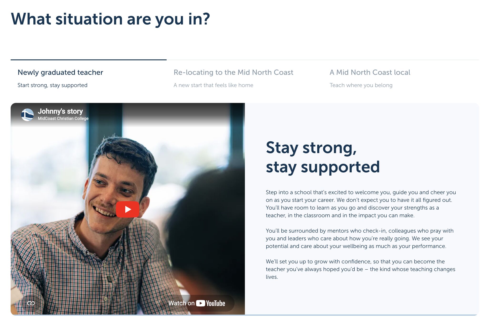
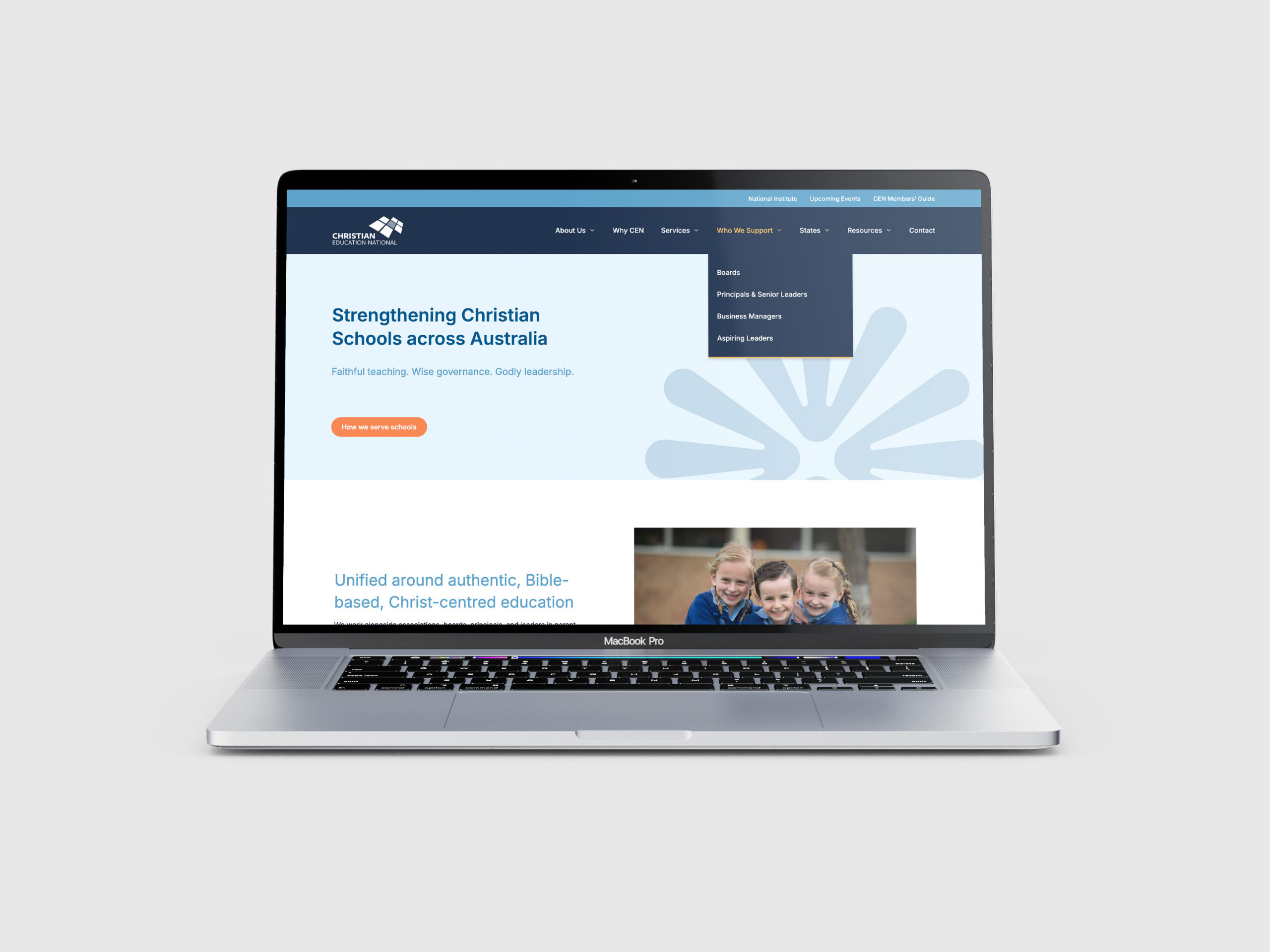
A targeted website re-skin helped a small rural school align its digital presence with a refreshed brand, improving clarity, warmth, and next-step momentum without costly rebuilds or operational disruption involved.
Case Studies
The stories of schools reshaping their brand, websites, enrolment journeys, and parent experiences.
A warm orientation booklet helped new Prep and Kindergarten families feel prepared and cared for, blending practical details with emotional reassurance and reflecting the relational heart of Belmont Christian College from day one.
A coffee-table anniversary book gathered four decades of stories, photographs, and memories at Belmont Christian College, honouring the people who shaped the community and creating a timeless artefact of identity and belonging.
Experience mapping helped CEN move beyond lists of services toward a situationally driven marketing approach, creating clarity, consistency, and a more relevant way of engaging with school leaders across Australia.
A full-day, documentary-style photoshoot captured the real heart of MCCC, focusing on community, connection, and everyday moments. The images now anchor the new website and reflect the school’s true identity.
A three-hour workshop gave NVCS its first clear messaging framework, distilling the school’s relational identity into a practical strategy that now guides the prospectus, website, photography, and future communications.
Using a parent experience and enrolment journey workshop to clarify an enrolment journey, shifting from reactive processes to a shared trust-building framework that better supports families, referrers, and students.
MidCoast Christian College brought its new brand manifesto to life through a student-led video, turning a poetic script into a warm, authentic expression of the school’s story as families first encounter it.
A school undertaking its first-ever professional photography day, capturing real student life and authentic community moments. The new images replaced outdated visuals and became the foundation of a warmer visual identity.
A film-style photoshoot gave BCC a visual language worthy of its new brand. Grain, movement and everyday moments brought “Shaping people the world needs” to life with honesty and imagination.
Mapping an enrolment journey for the first time, revealing hidden gaps, clarifying the pre-application stage, and creating a scalable, parent-centred foundation to guide all future enrolment and experience improvements.
A structured small group tour that booked out quickly, reduced admin work, and created a more consistent, story-led experience that helped families feel known and confident in their next step.
Replacing a slow, outdated site with a clear, fast, parent-centred website that tells the right story, removes friction, and gives staff full control to keep content current and useful.
Aligned marketing and admissions around one clear priority through a focused workshop, replacing fragmented efforts with a shared language, a united direction, and a renewed commitment to improving tours.
A small rural school with a big heart needed something tangible to share its story. Together, we created a prospectus that captured Namoi Valley’s warmth, values, and distinct sense of community.