
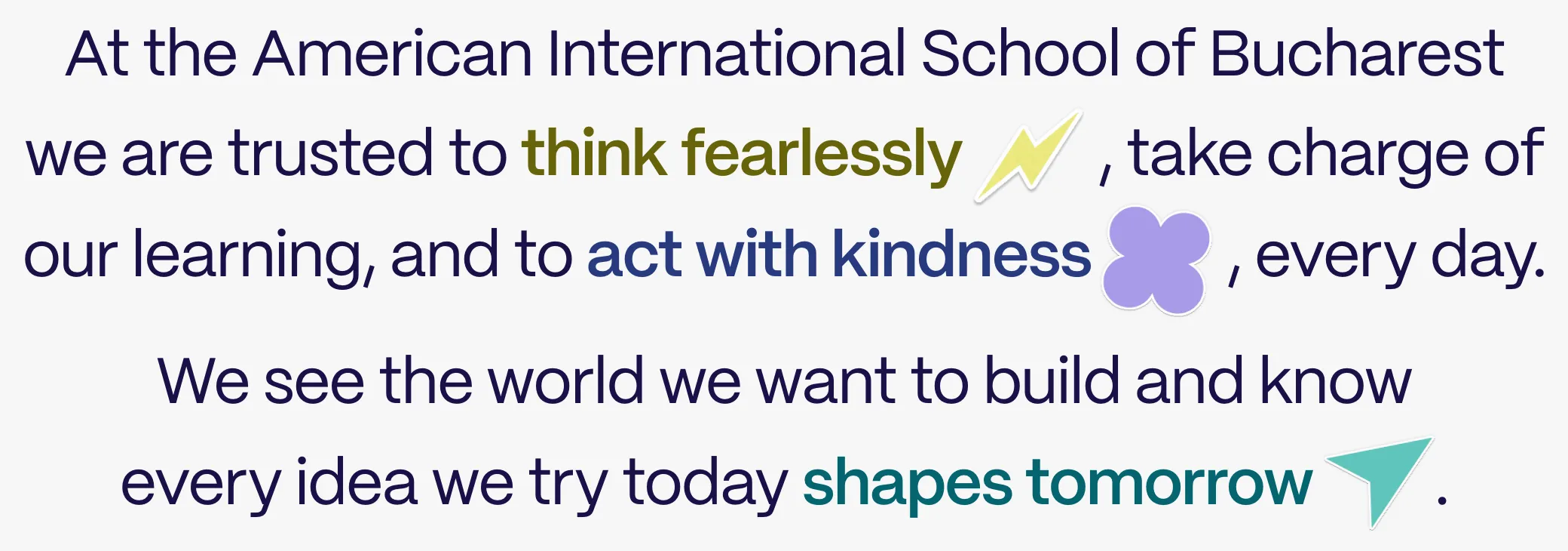
Think fearlessly
AISB Student, Grade 8


Before we thought seriously about visuals, we spent months making sure that this website served the humans at the centre.
We partnered with Yellow Car, who had masterfully facilitated a new student-led mission for the school. Think fearlessly, act with kindness, shape tomorrow. They needed a new website, and we wanted to ‘put legs’ on that new mission every step of the way.
“It’s been a joy working together on this project. We’re grateful for the collaboration with Yellow Car and Bolsta, and especially proud of how our students are helping shape the campaign. Excited for what comes next.”
We always – always! – start by listening. Why is this website getting rebuilt? What’s frustrating you? Who uses the website? What are their jobs, goals, frustrations? To what extent do we need to integrate within the current brand, or push beyond it? Our Miro boards got a real workout.
The students wrote the mission, and the school was proud of it. We wanted it to do more than hang in the entrance hall. Putting ‘legs’ on a big statement like a school mission is an area we love to work in at Bolsta Education. “Top down” statements require “bottom up” expression. We use story, language and visuals to build a world for those big statements to exist in. The beauty of creating a world is that you create space for the mission to be explored, reimagined, even questioned by the people it speaks to every day.
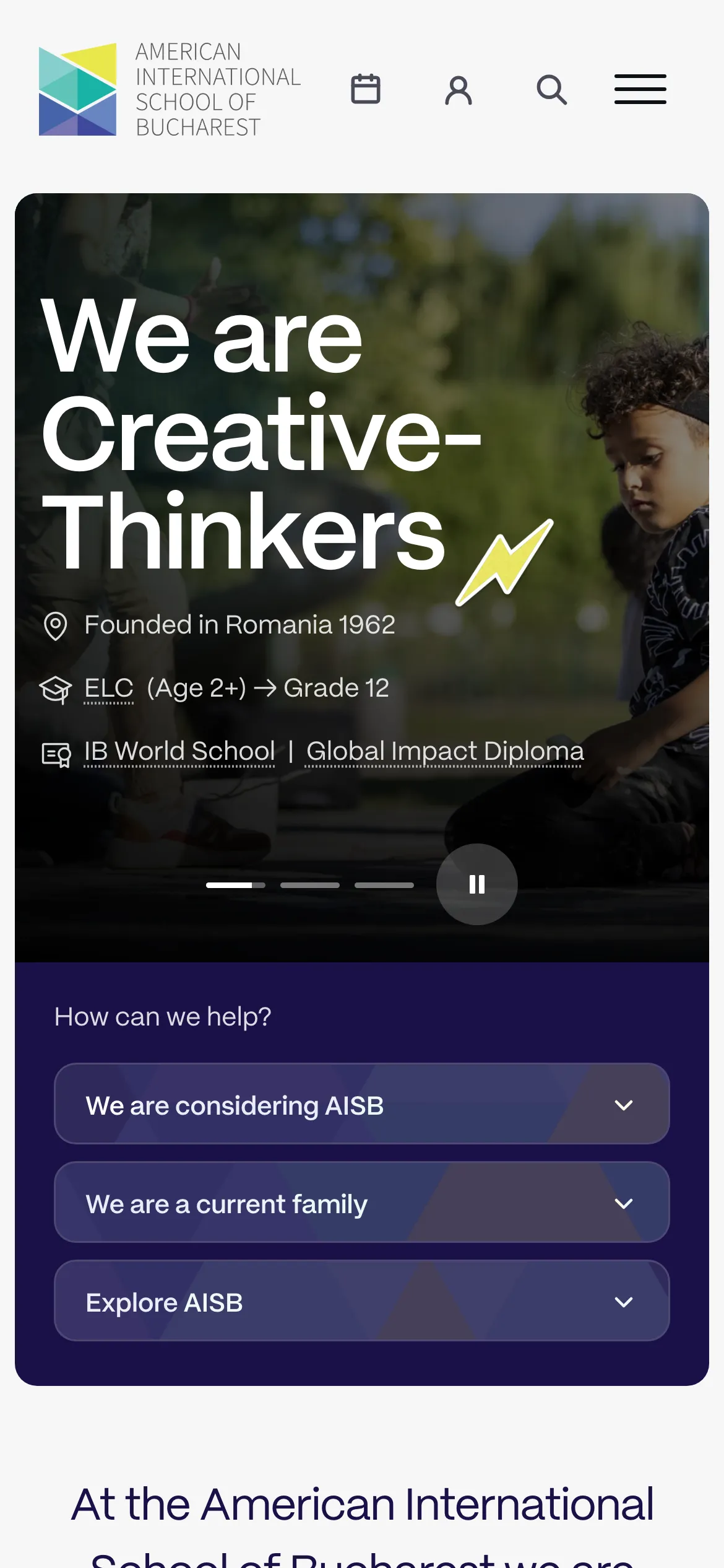
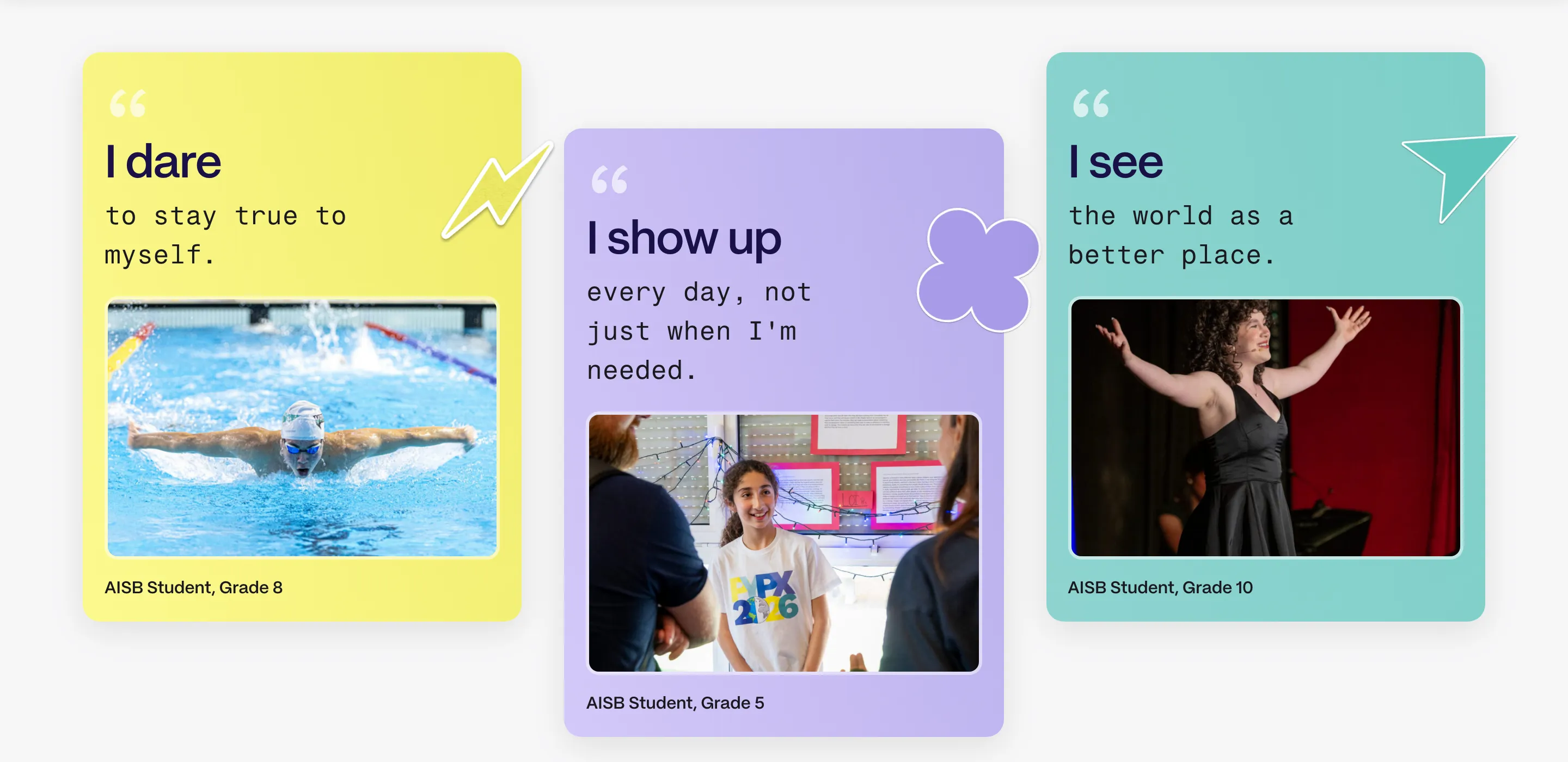
For AISB, we built a messaging device around it. Three sentence starters: I dare, I show up and I see, each left open to invite people to finish it themselves. Each pillar has its own shape, colour and voice, to help create that world: a bolt for daring, a clover for showing up, a paper plane for seeing what comes next. The statement stays the hero. The worlds around it let students, staff and families say it and experience it in their own words.
Think fearlessly
AISB Student, Grade 8
Act with kindness
AISB Student, Grade 5
Shape tomorrow
AISB Student, Grade 10
Partway through, we sat down with the student group who wrote the mission and showed them the early language and visuals. They said it made them proud of their school. The symbols were new, but the school’s colours kept it grounded, and it still felt like “AISB”.
On the website, the three worlds do the wayfinding. The bolt, the clover and the plane mark the homepage headlines, the mission sentence, the Our Mission page and the student-written cards. Lines written by students are (almost) the first thing a prospective parent meets on their first visit, in the same colour, beside the same shape. It says “this isn’t just lip-service. We mean it.”
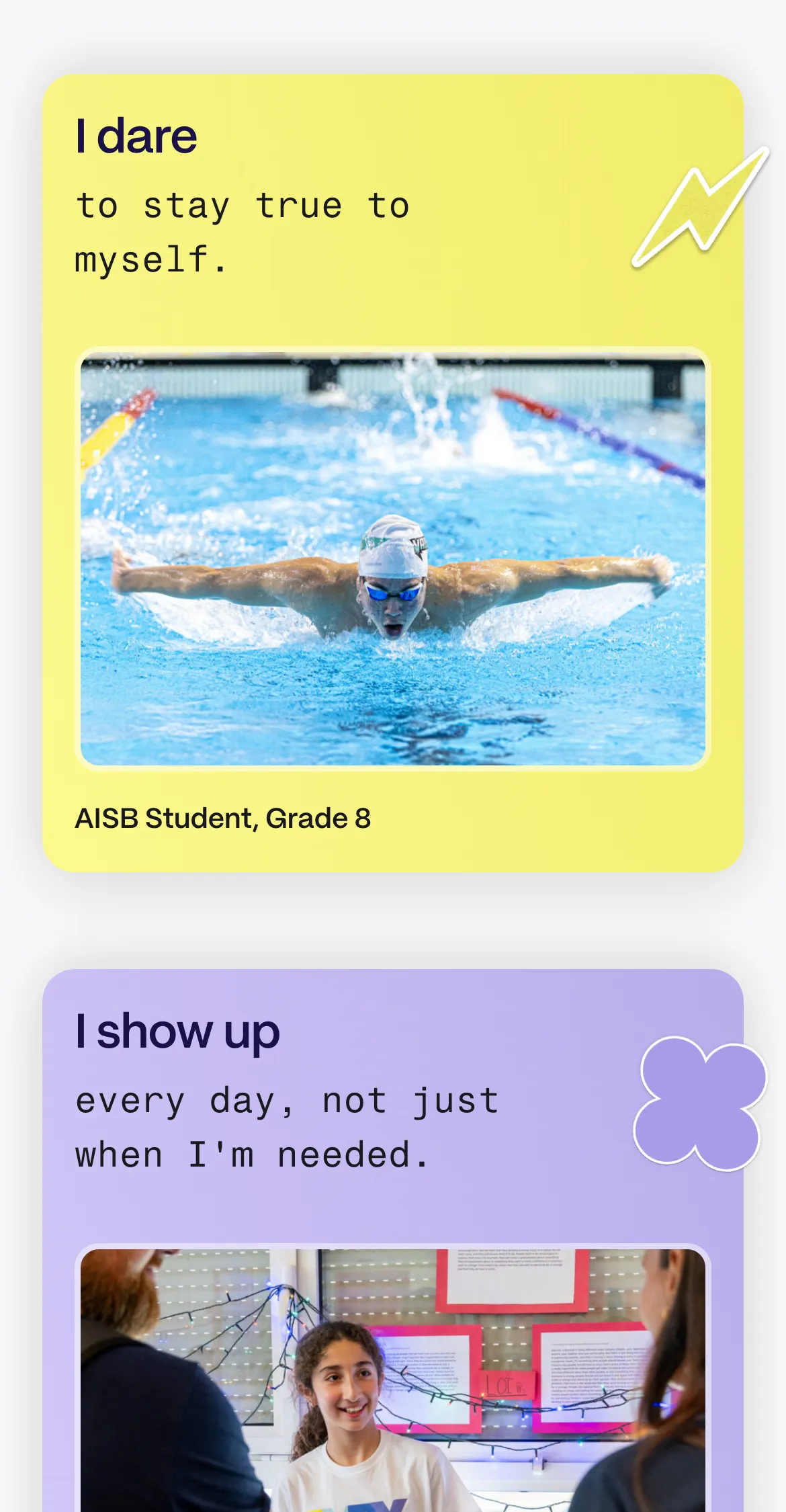
A mono version of the type is kept for human voices and nothing else. When you see it on the site, a person is speaking.
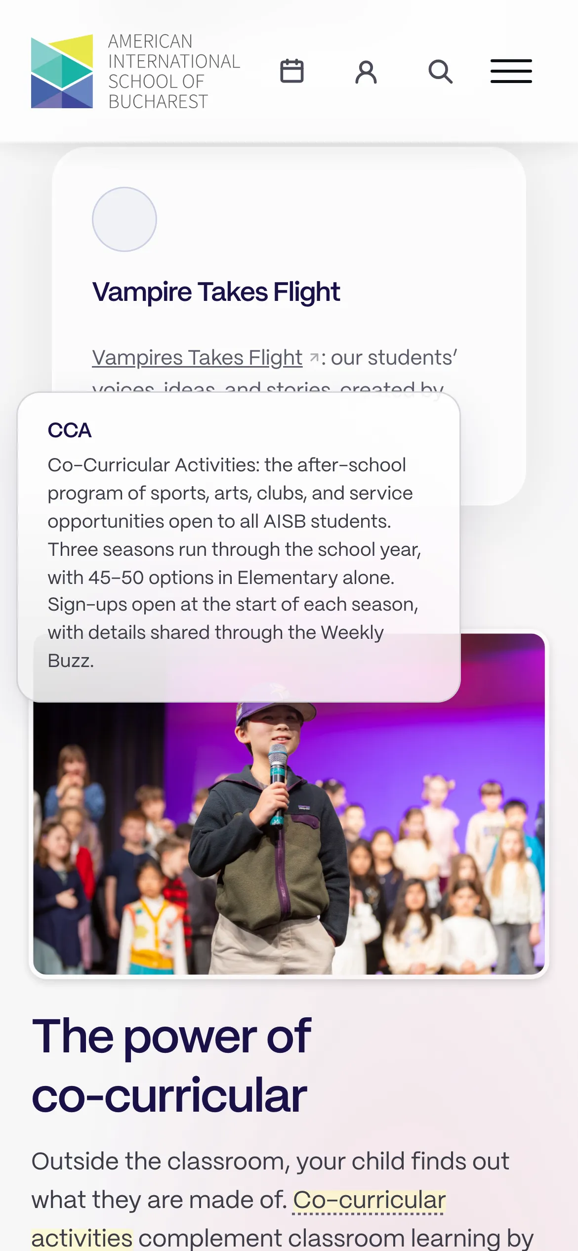
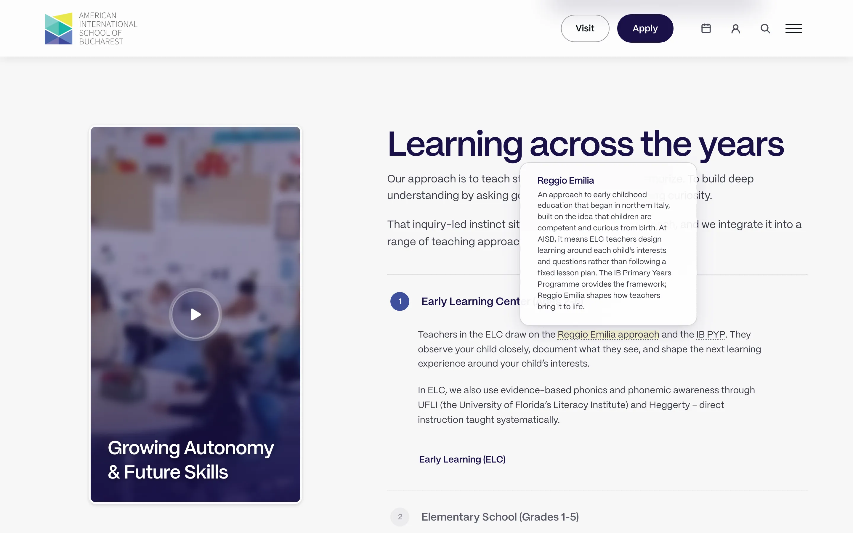
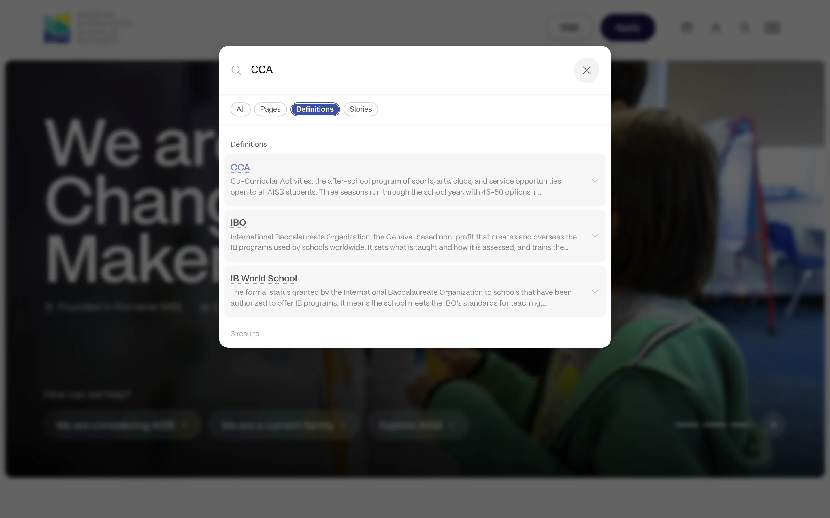
Families new to IB schools meet a lot of acronyms. Terms like IB World School, Reggio Emilia and CCA have a dotted underline that opens a plain-language definition, without leaving the page.
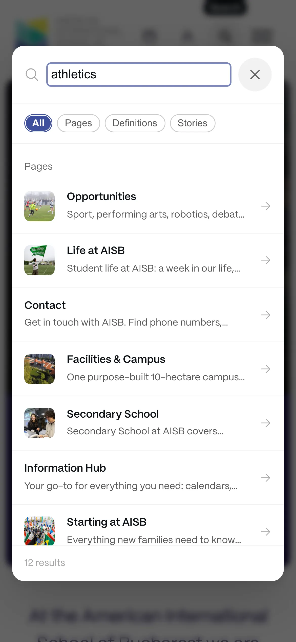
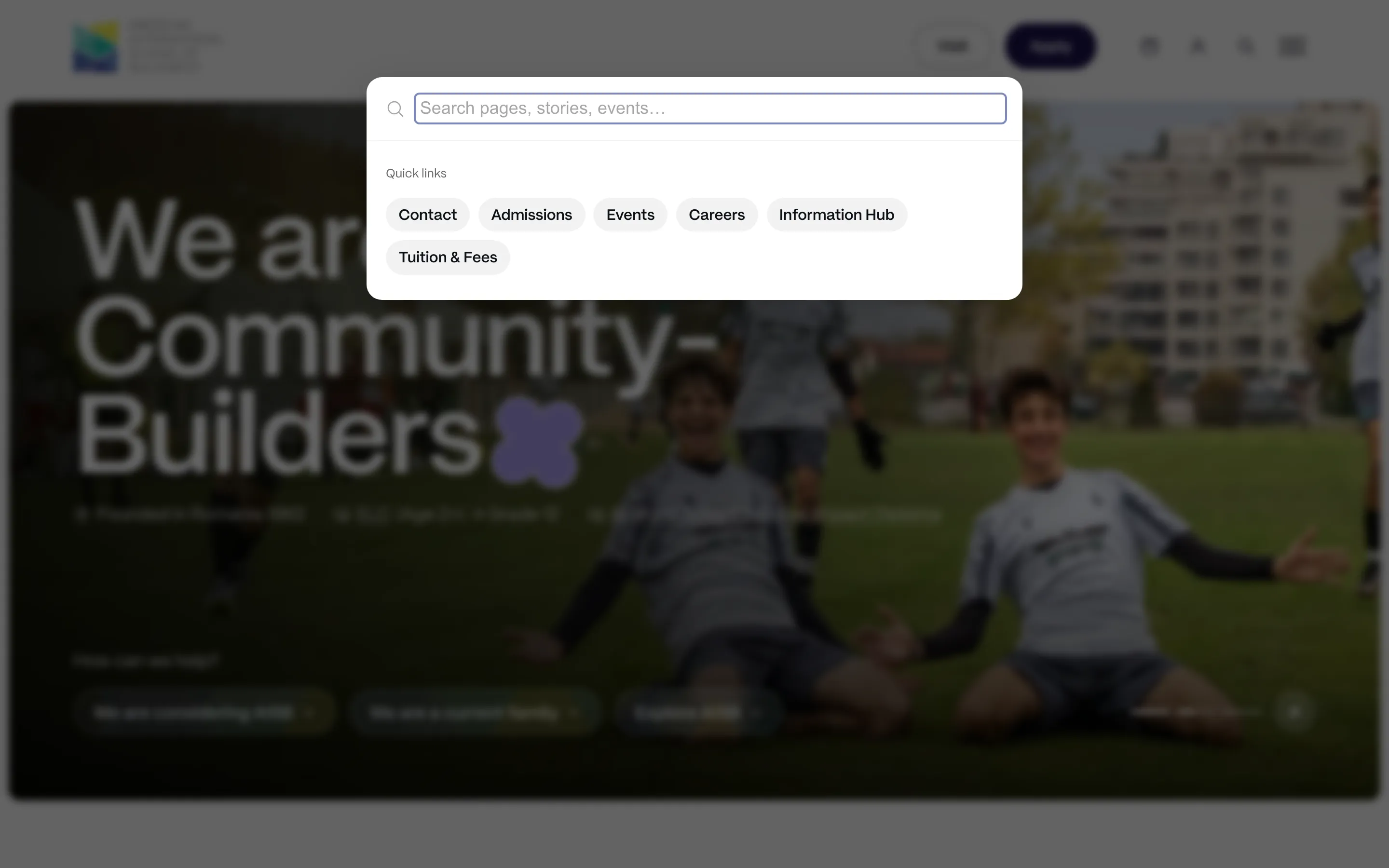
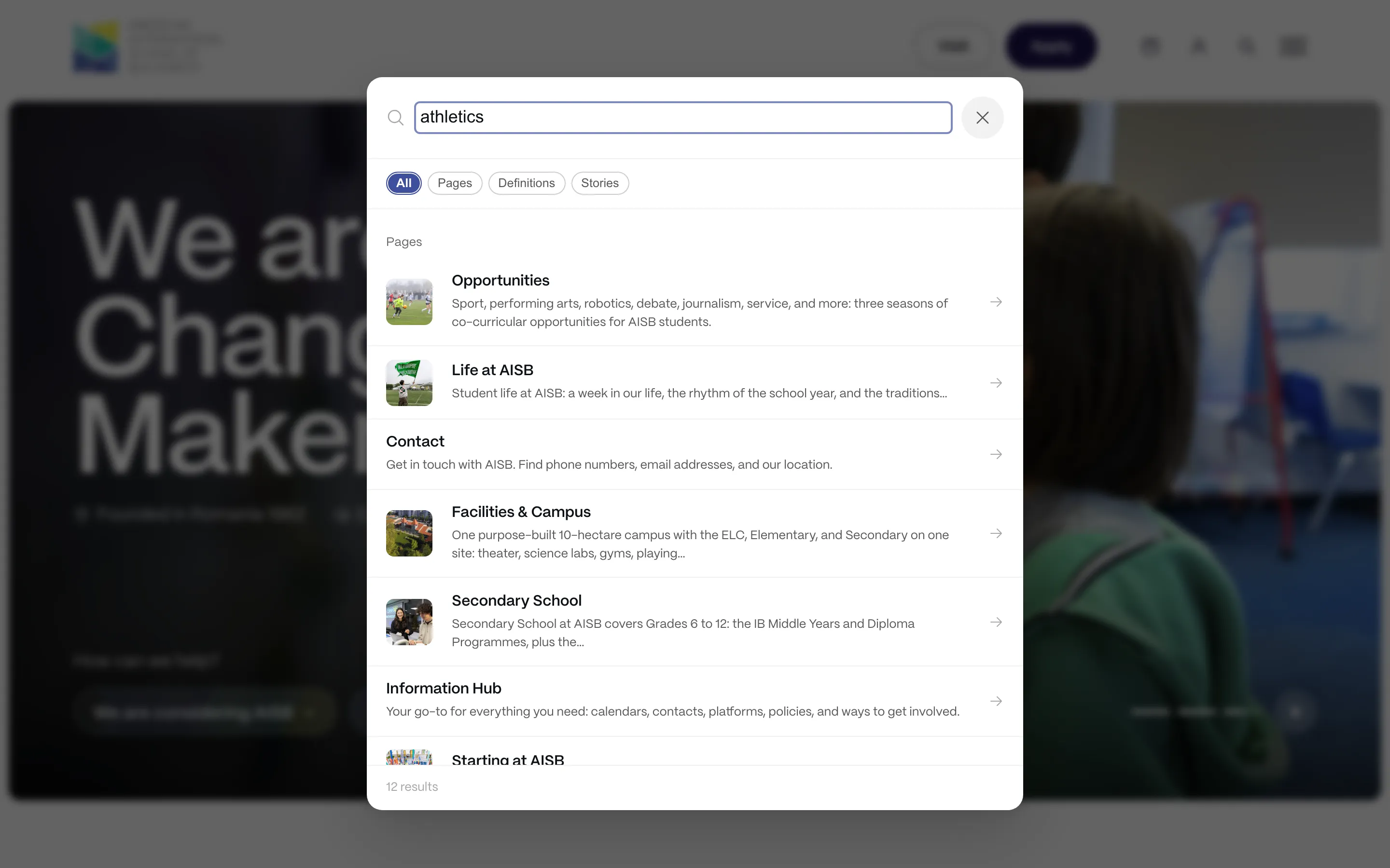
The site search opens over any page, commonly known as a ‘command palette’ or ‘unified search’. It returns pages, stories and glossary definitions all at once.
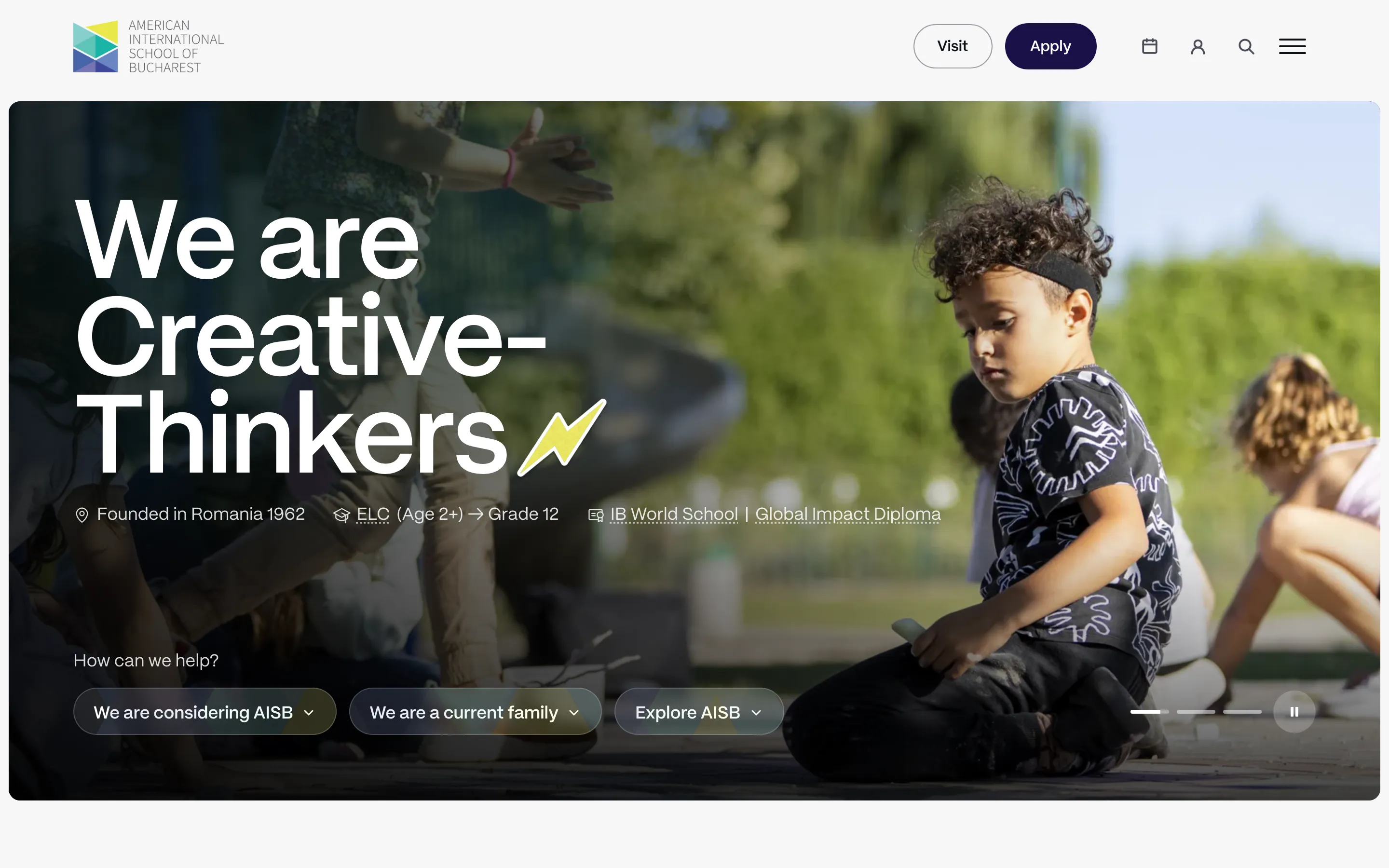
The calendar was one of the most visited pages on the old site, so it has its own icon in the header beside search and the parent portal. Current families also have an Information Hub that gathers what they need in one place.