Summary
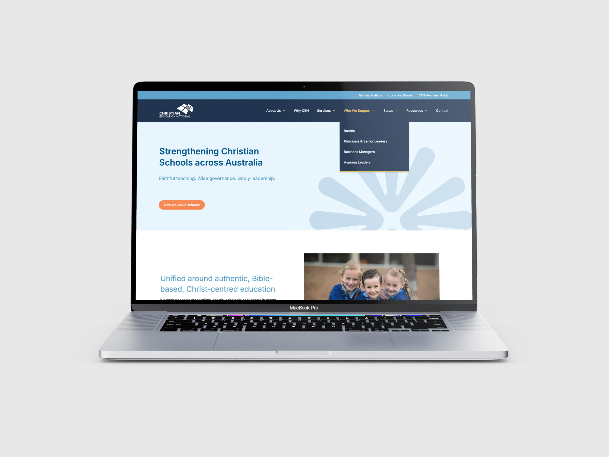
Your school website is often the first place families go before deciding whether to enquire. A good website builds trust, reduces confusion and helps families picture themselves in your school.
Here’s what to include to support stronger enrolment outcomes.
1. A clear story of who you are and what you stand for
Families aren’t looking for slogans. They’re trying to answer: Does this school feel right for our child?
Your website should make your identity clear. This means:
- Plain language about your values and educational approach
- A tone that matches the real experience of your school
- Stories or examples that feel lived-in, not generic
If you offer strong relationships, show them. If you lead with community, make that visible in the way you speak and structure your content.
If you’re unsure on your story, it might be a good time to pause and consider whether you need to work on your story before your website.
2. A dedicated enrolment section that guides parents step by step
One of the most common problems I see on school websites is enrolment information buried in multiple tabs.
Fix this with a clear, structured enrolment section that covers:
- How to enquire, apply and enrol
- Key dates and timelines
- Fee structure in plain language
- What to expect at each step (tour, interview, offer, onboarding)
When parents know what’s coming, they feel more confident in your process.
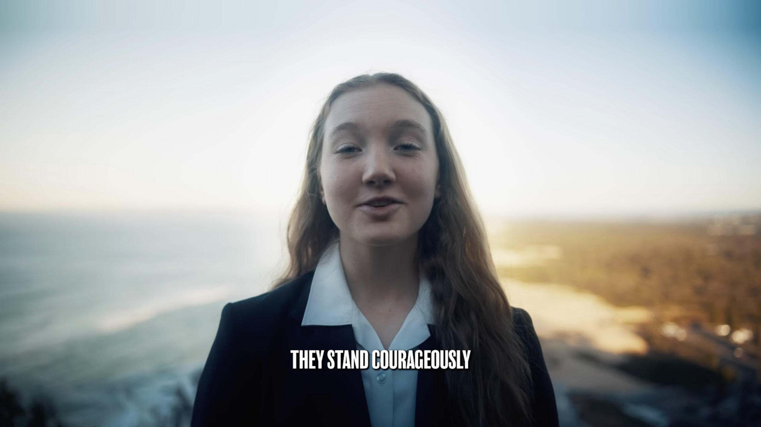
3. A human welcome (not just a message from the Principal)
A great website feels like walking into your school. That means giving parents a sense of welcome.
Ways to do this:
- Use photos that show real moments in your school
- Include a short video walkthrough or welcome message
- Make contact options personal (e.g. “Talk to our Enrolments Officer, Jasmine” not “Submit your enquiry here”)
- Share the voices of your students and teachers, not just leaders
Tone matters. Warm, clear language builds trust before anyone picks up the phone.
4. Parent-relevant navigation
Most school websites are structured around departments. Families don’t think that way. They think:
- “What will life be like here?”
- “How does this school support kids like mine?”
- “What do I need to know to decide?”
Reframe your site structure around real parent questions. Group content into ‘buckets’, such as:
- Academic and wellbeing approach
- Community and co-curricular life
- Enrolment information
- Practical details (transport, fees, uniforms)
If you make it easy for families to find answers, they’ll stay longer and engage more.
5. Enquiry pathways that reduce friction
A strong website makes it simple for families to take the next step.
Good enquiry pathways include:
- Short enquiry forms with clear follow-up expectations
- Easy-to-book tours (ideally self-service)
- Clear contact details for a real person
- Helpful content that answers common questions before they’re asked
Each of these builds trust and reduces drop-off.
6. A site that works on mobile
More than half of school website visits come from mobile devices. If your site is hard to navigate, slow to load, or poorly formatted on a phone, parents will leave.
Invest in responsive design. Test every key page on mobile. Make sure forms, buttons and menus are easy to use.
Final thought
Your website doesn’t need to win awards to be a great website. It needs to be clear, human and aligned to the real experience of your school. When it is, parents will trust it, and you by extension.
About the author
Jacob Shultz
Founder, Bolsta Education
Jacob is a specialist in experience strategy for schools. His focus is on improving the lived experience of schools — through story, systems and the small moments that shape how families feel.